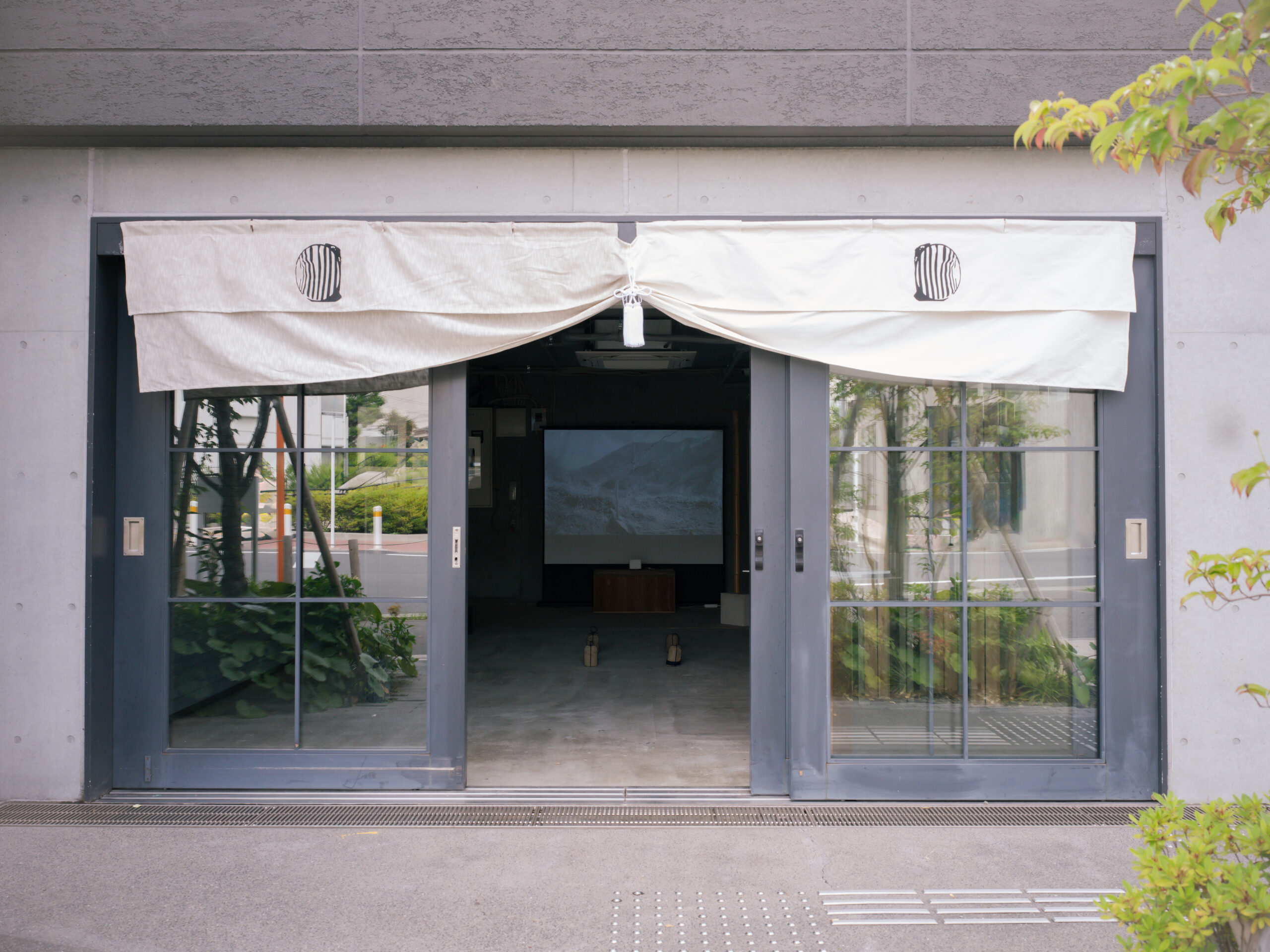
Artefacts, Habitudes, Origins, Snippets / Graphics, Wares
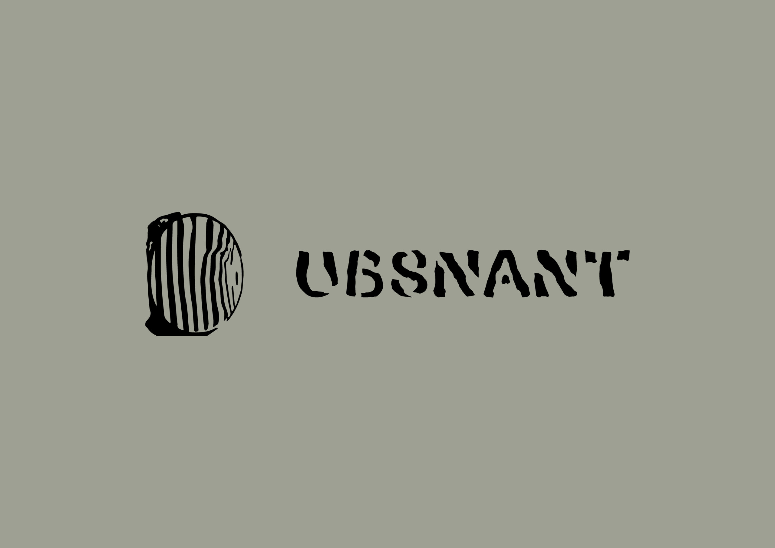
Ubsnant Emblem
ウブスナント標章
This is a design for our emblem embodying the creative approach of Ubsnant, which involves interpreting the context of diverse subjects.
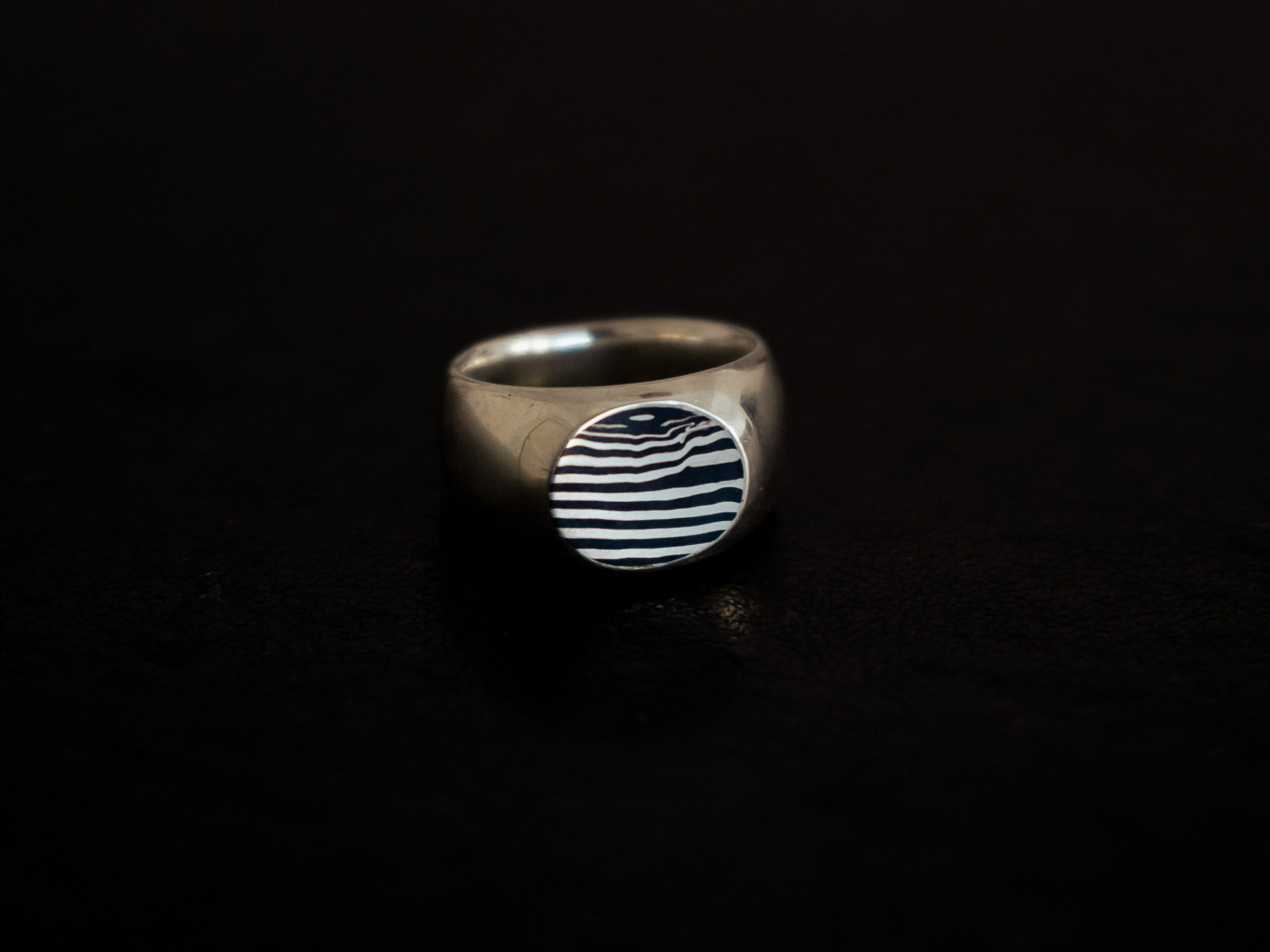
- Date
- April 2024
- Materials
- Mokume-gane (silver and red copper)
- Directors
- Chisako Suzuki, Asuka Hoshi, Arata Suzuki
- Cooperation
- Nakamura Inc.
- Craftsman
- Asuka Hoshi
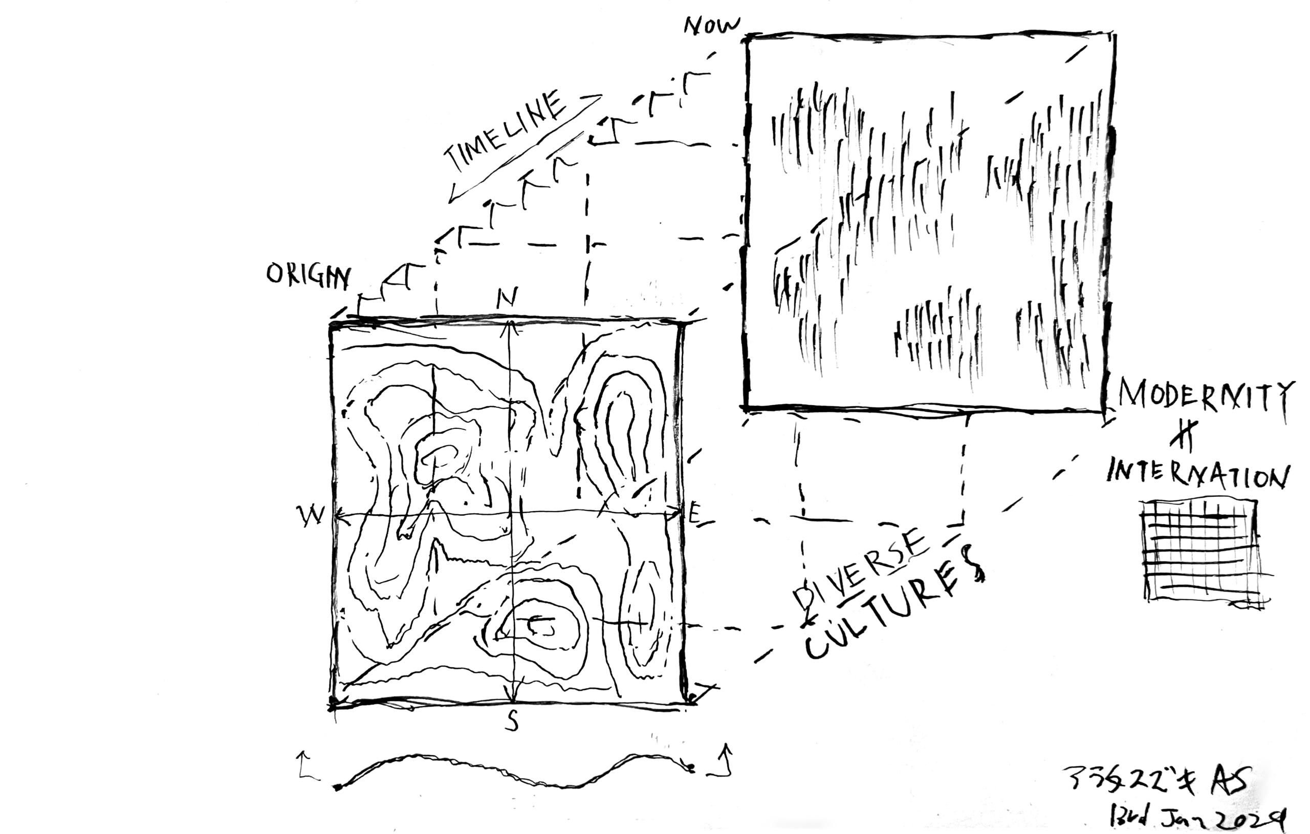
This design sought organically formed shapes that avoid imposing specific imagery, allowing multiple interpretations to emerge through the viewer's perspective. Consequently, the process adopted involved identifying the most suitable pattern for the emblem from the Mokume-gane designs created by Art Director Asuka Hoshi.
Mokume-gane is a traditional Japanese technique that produces wood-grain-like patterns by layering different metals and then processing them. Asuka Hoshi mastered this technique whilst studying metal engraving.
The patterns born from Mokume-gane, true to its name, possess shapes reminiscent of tree rings. This represents the SNIPPETS that is one of the five annotations of Ubsnant.
To some observers, it may resemble the cross-section of geological strata accumulated over vast periods. This represents the ORIGINS that is one of the five annotations of Ubsnant.
Furthermore, it may be perceived as resembling human fingerprints. This represents the ARTEFACTS that is one of the five annotations of Ubsnant.
Additionally, it could evoke the light waveforms like PSR B1919+21 or sound waveforms. This represents the HABITUDES that is one of the five annotations of Ubsnant.
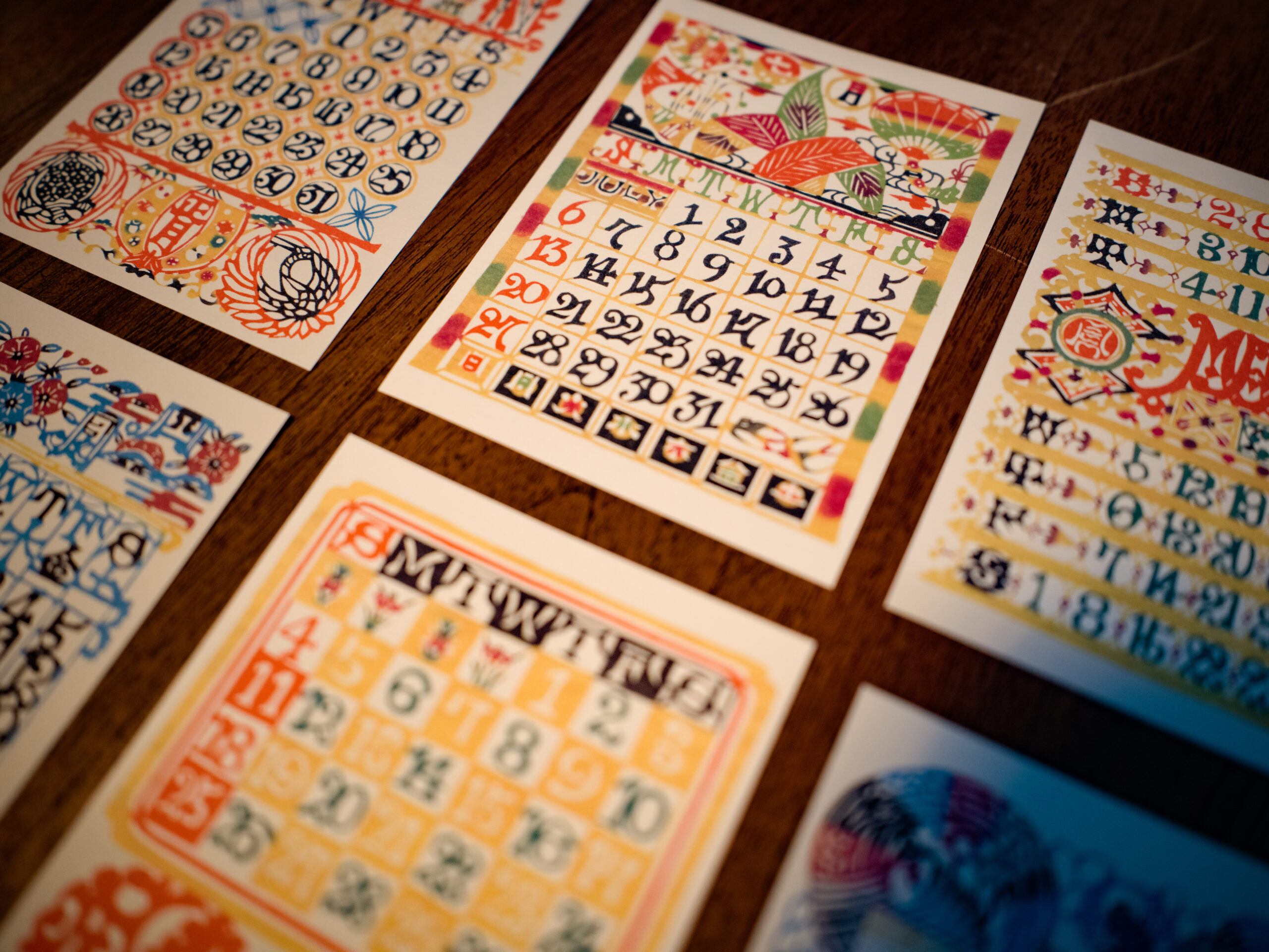
In the design of the characters themselves, we considered it fitting to incorporate elements beyond complete human control, much like patterns. Our reference was the characters used in a calendar created by dyeing artisan Serizawa Keisuke using the katazome technique. By geometrically organising the inherent fluctuations of handcraft, such as bleeding and blurring, we have composed the UBSNANT character set, where both the aura of handwork and meticulous design are perceptible.
ウブスナントの創作手法である「様々な対象の文脈を読み取ること」を視覚化した標章のデザインです。
本デザインでは、鑑賞者の解釈によって複数の見方が生まれるよう、具体的な心象を押し付けない自然発生的な形状が求められました。そのため、 アートディレクターである星飛鳥が制作した杢目金の模様の中から、標章として最適な紋様を見つけ出す工程を採用しました。
杢目金とは、 種類の異なる金属を層状に重ね合わせた後に加工を施すことで、木目のような紋様を生み出す日本の伝統技法です。星飛鳥は、彫金を学ぶ過程においてこの技法を身につけました。
杢目金によって生まれた紋様は、 その名の通り、 木の年輪を思わせる形状を有しています。これはウブスナントの5つの注釈のうち、SNIPPETS(断片を読み取る)を示しています。
また、 ある鑑賞者には、 長い時間をかけて積み重なった地層の断面のように見えるかもしれません。 これは、 ORIGINS (象りを読み取る) を意味しています。
さらに、 人間の指紋のように認識されることもあるでしょう。これは、ARTEFACTS(拵えを読み取る)に対応しています。
加えて、 PSR B1919+21のような光の波形や音の波形を想起させる見え方も考えられます。 これは、 HABITUDES (佇まいを読み取る) を示しています。
文字の造形においても、 紋様と同様に、 人間が完全に制御しきれない要素を内包した表現がふさわしいと考えました。参照したのは、 染色工芸家・ 芹沢銈介が型染の技法によって制作したカレンダーに用いられた文字です。滲みやブレといった手仕事特有の揺らぎを幾何学的に整理することで、手仕事の気配と緻密なデザインの双方が感じられるUBSNANTの文字列を構成しています。
Artefacts, Habitudes, Origins, Snippets / Graphics, Wares
Ubsnant Emblem
ウブスナント標章