Snippets / Furniture, Installations, Sculptures
Mimeoscope for Archeologists
考古学者のミメオスコープ
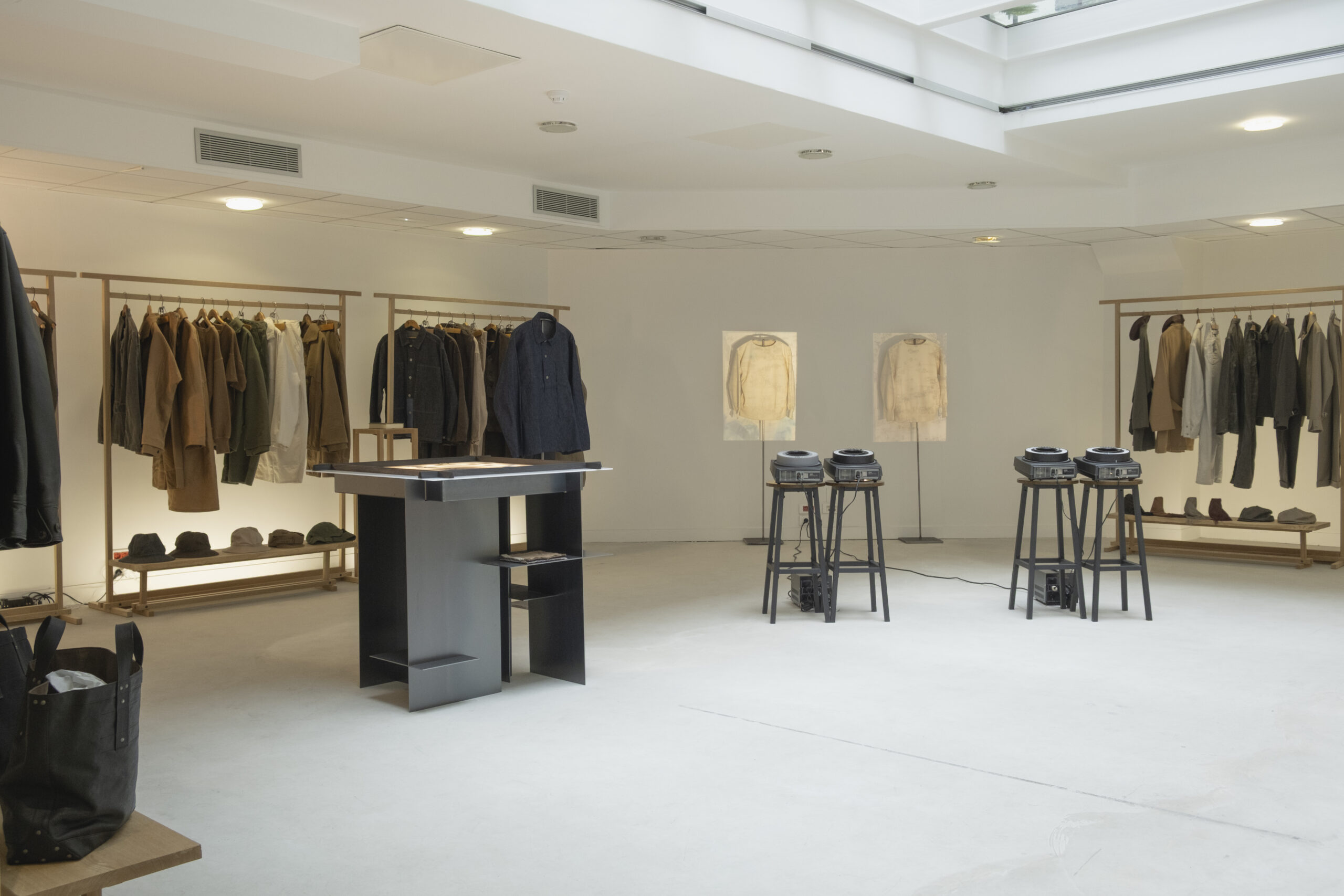
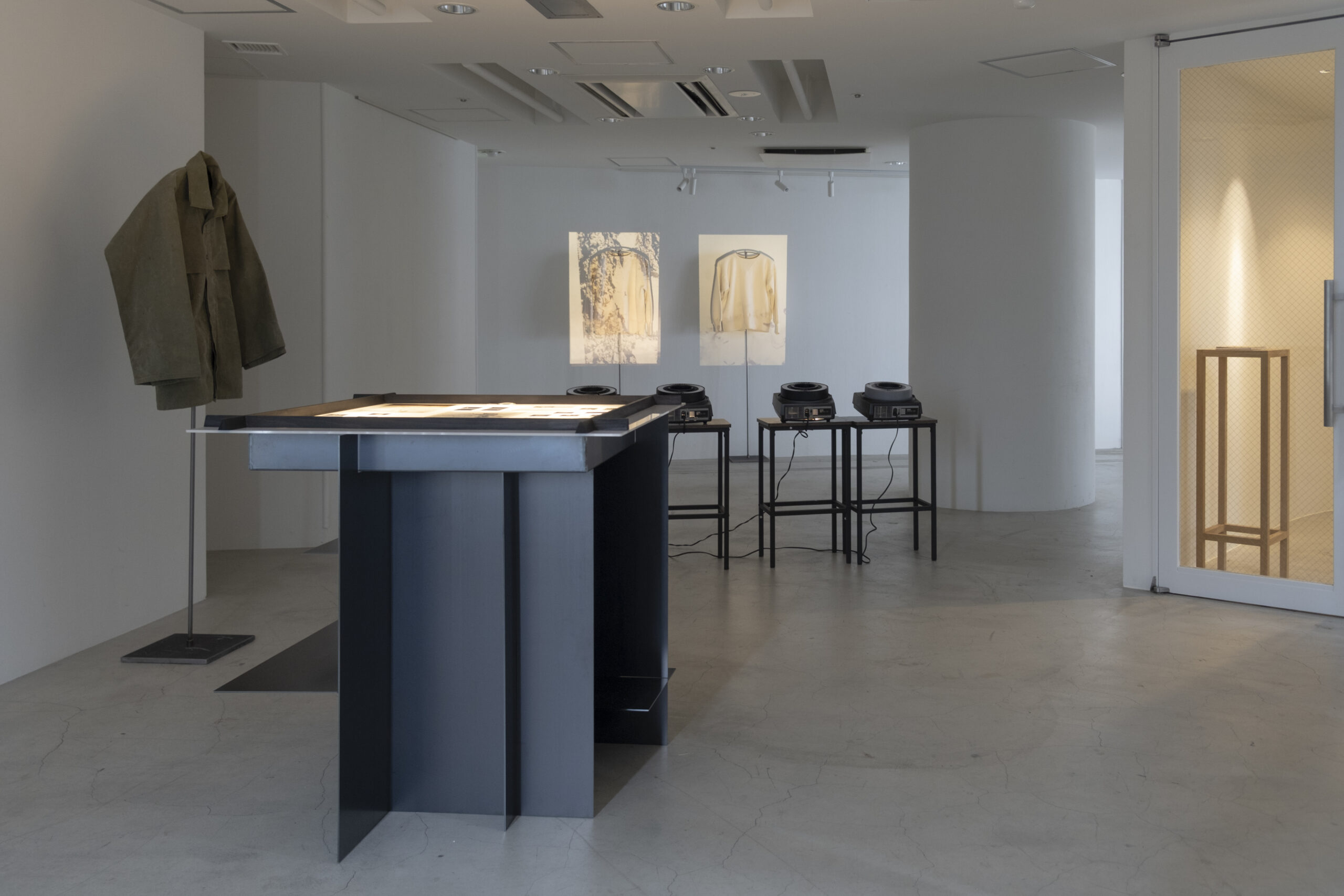
This is the design for the display fixtures of the Kyoto-based fashion brand Taiga Takahashi.
- Date
- July 2025
- Location
- Kyoto. Japan / Paris, France
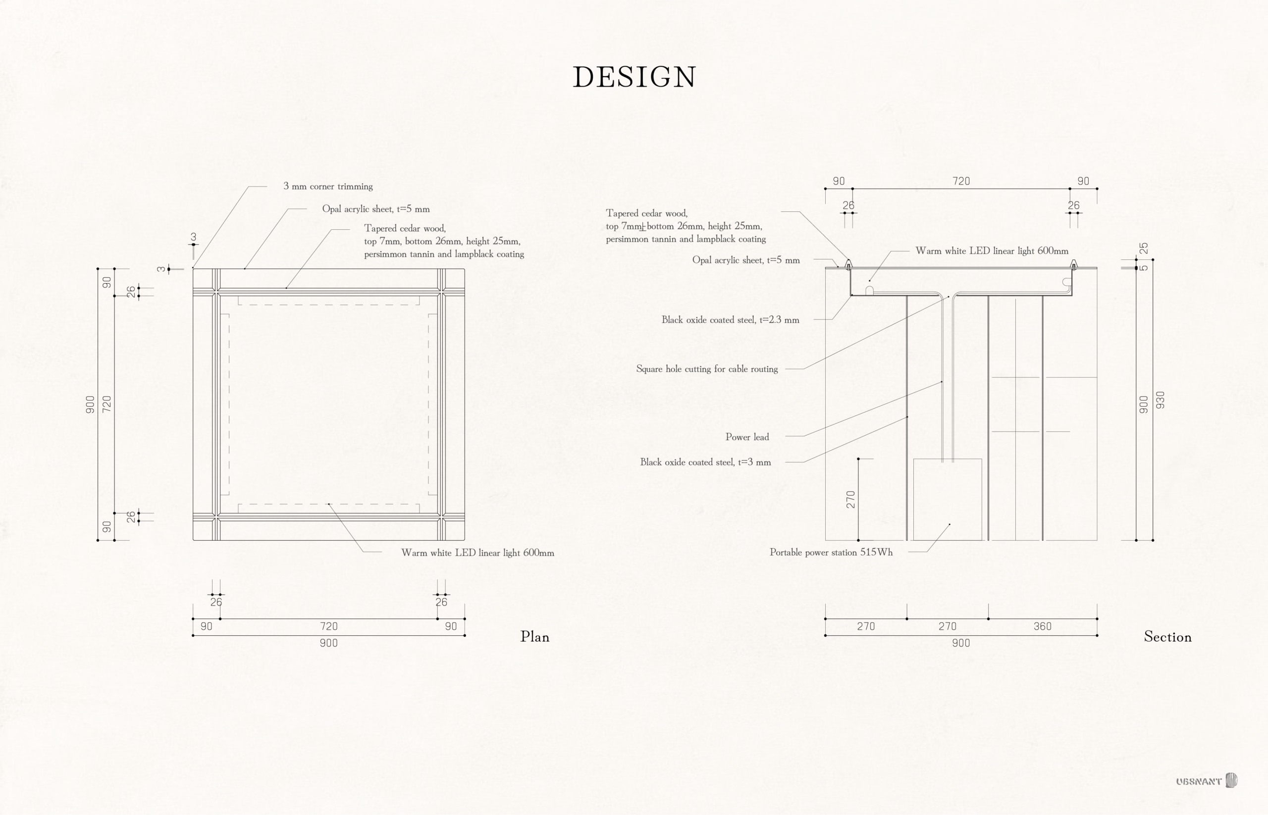
- Size
- 930 × 900 × 900 mm
- Materials
- Mill scale, Japanese cypress, persimmon tannin, charcoal, opal acrylic sheet
- Directors
- Arata Suzuki, Asuka Hoshi
- Collaborators
- Riku Matsuzawa, Rin Nagamoto, Yasu Yamamoto
- Client
- Taiga Takahashi
- Craftsmen
- Takahashi Tategu Joinery Manufacturing Co.
- Manufacturer
- Jonan Kogyo Co., Ltd.
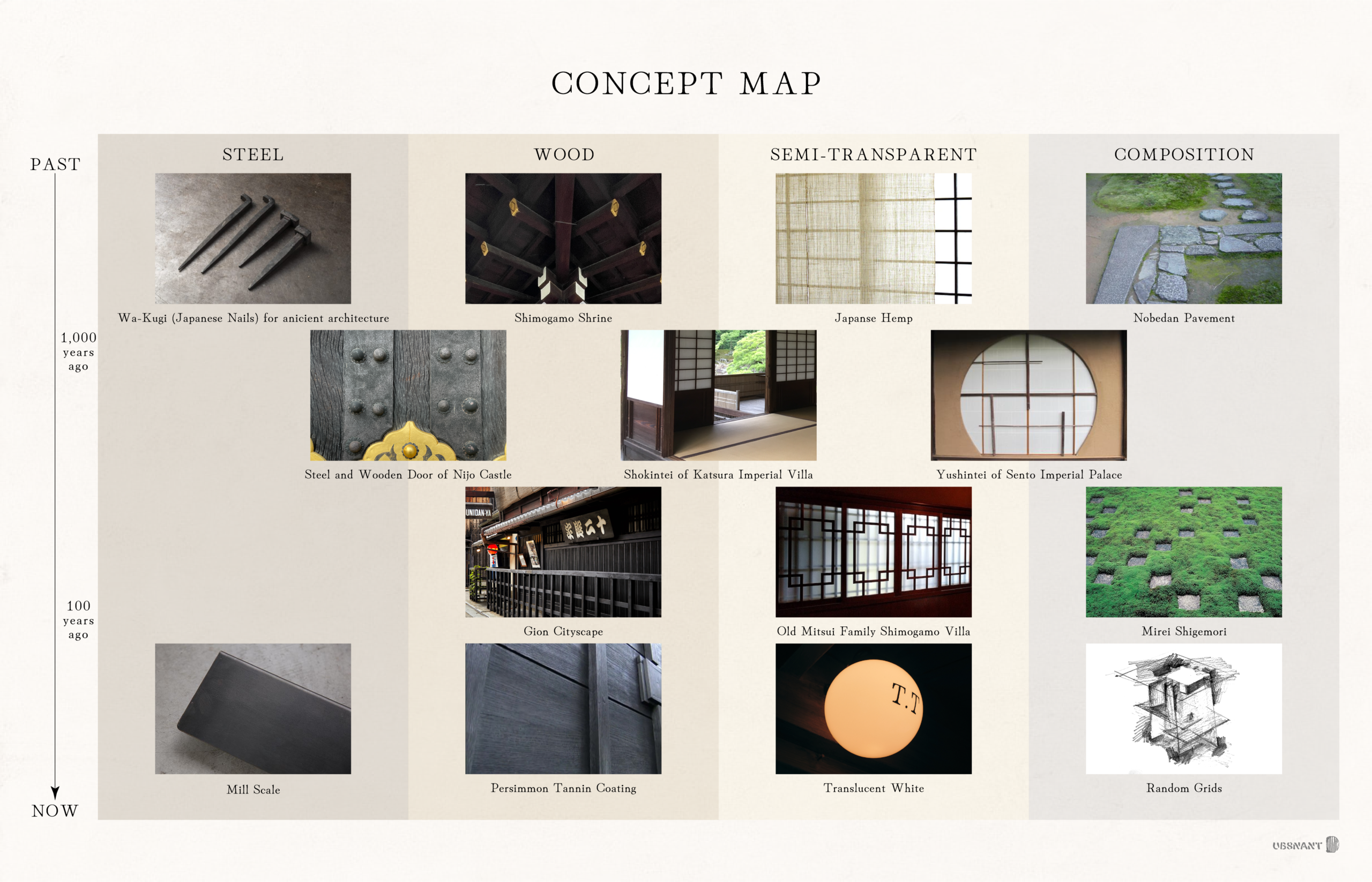
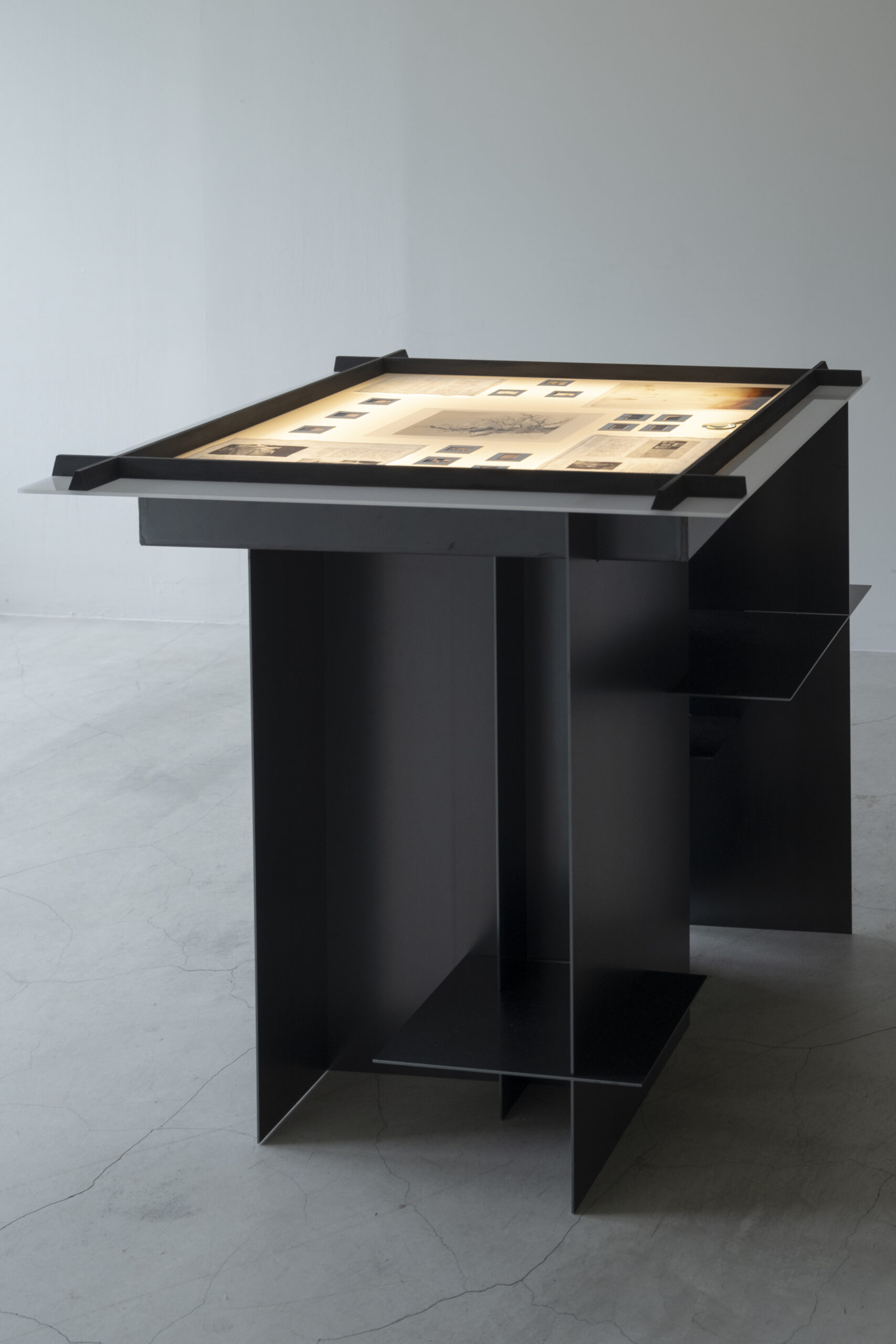
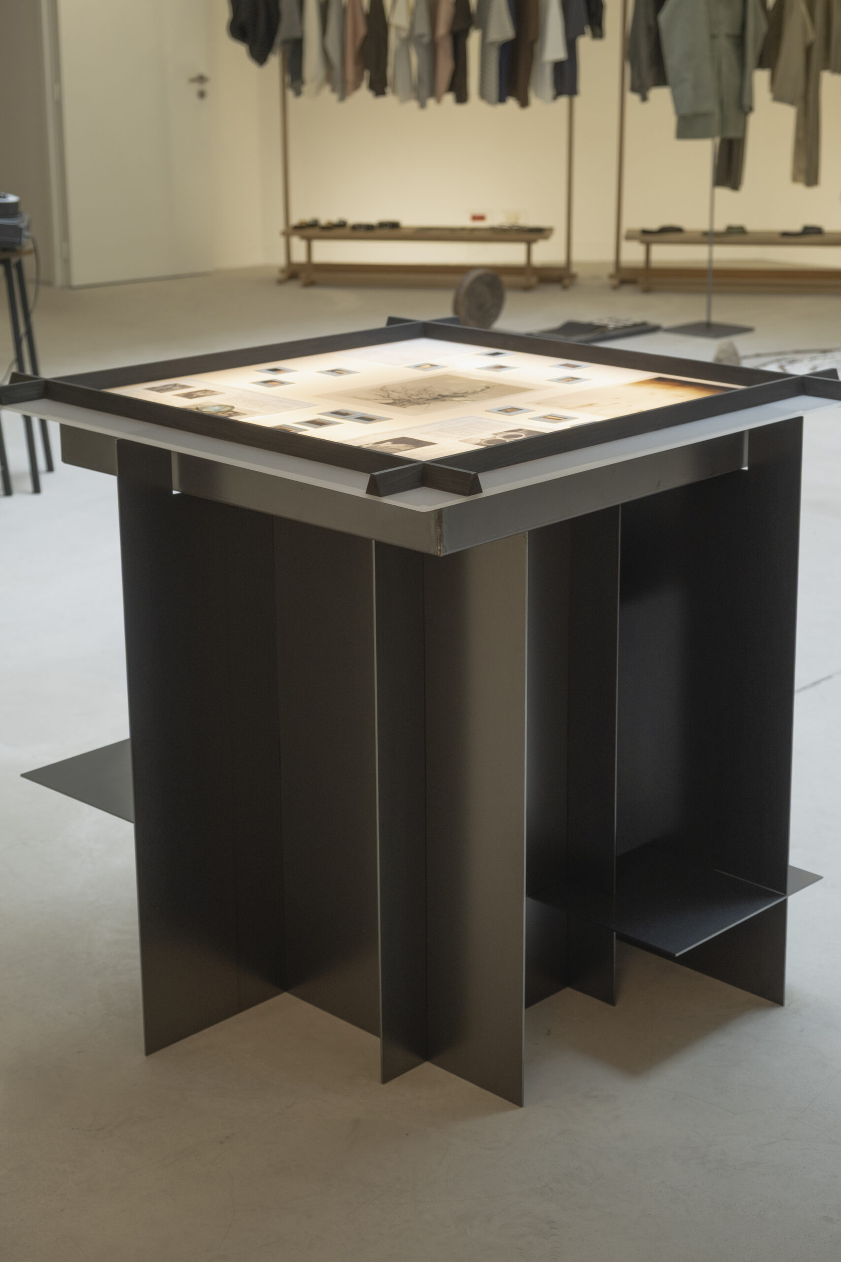
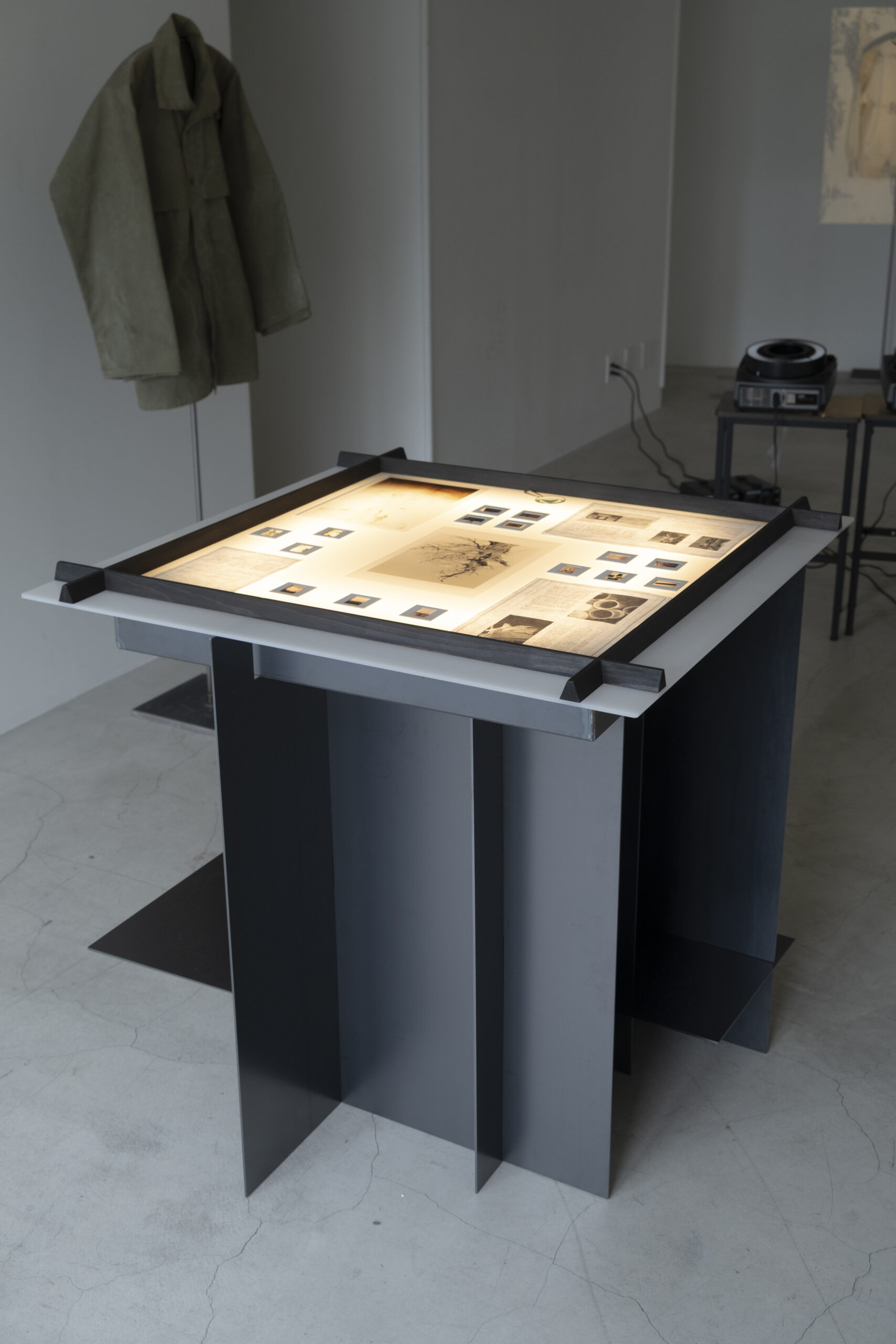
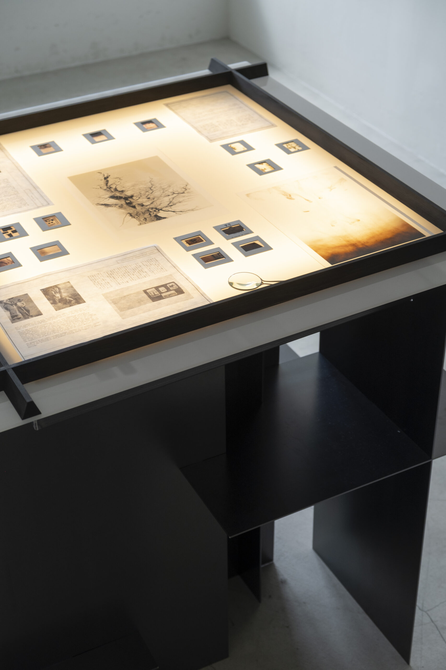
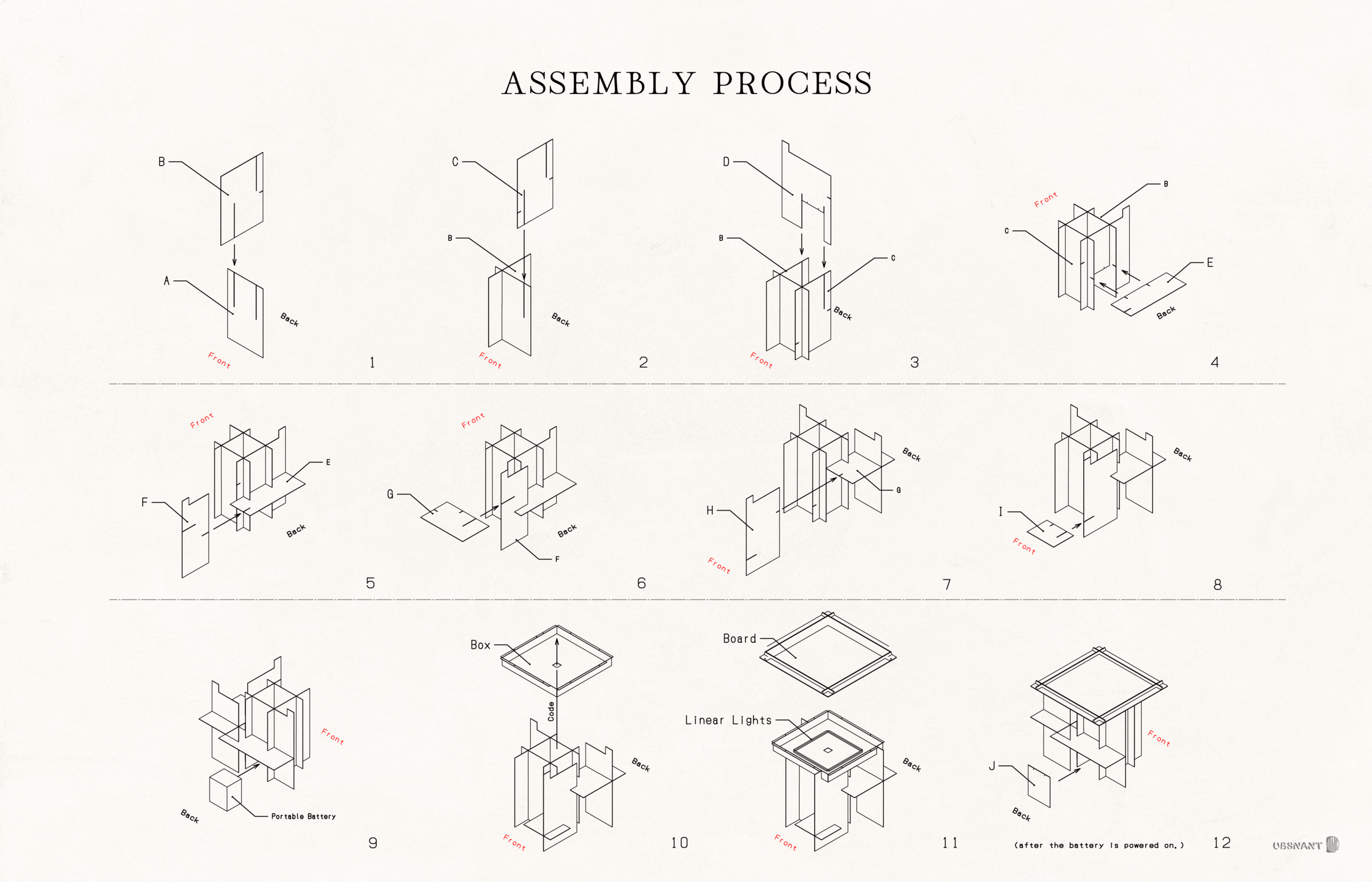
Taiga Takahashi advocates an “applied archaeology” philosophy, aiming to excavate future archaeological artefacts by reviving relics of the past. Consequently, the display fixtures required showcasing historical documents and archival photographs relevant to each season's theme. The mimeoscope—a light table format invented for reproducing blueprints and illustrations—was deemed the optimal solution.
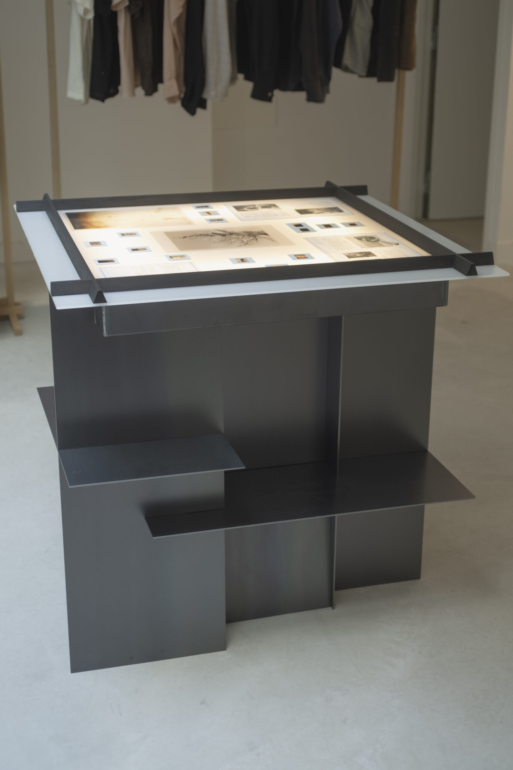
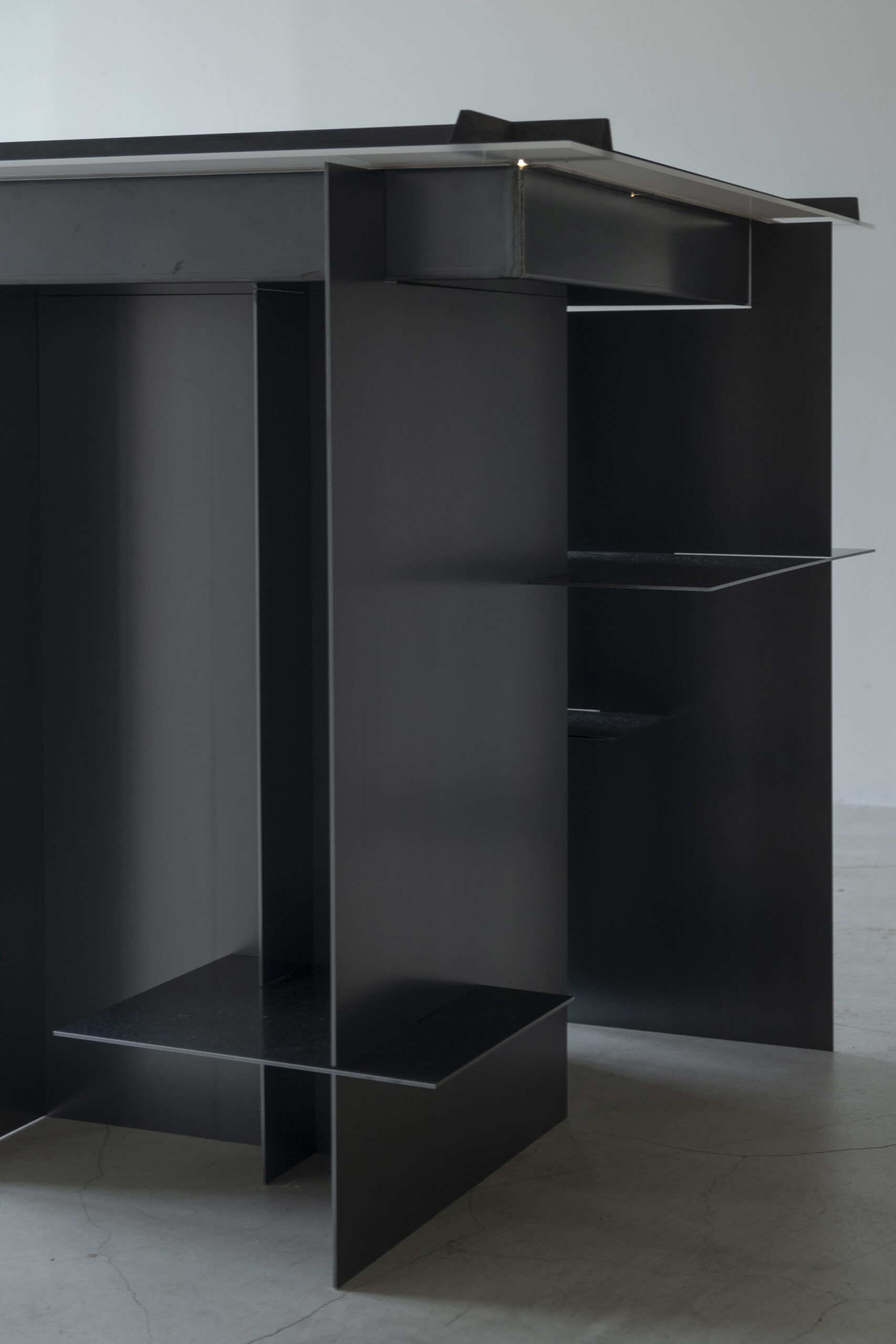
The design approach followed applied archaeology principles, reinterpreting time and techniques inherent in Kyoto architecture through the use of iron, wood, and translucent materials.
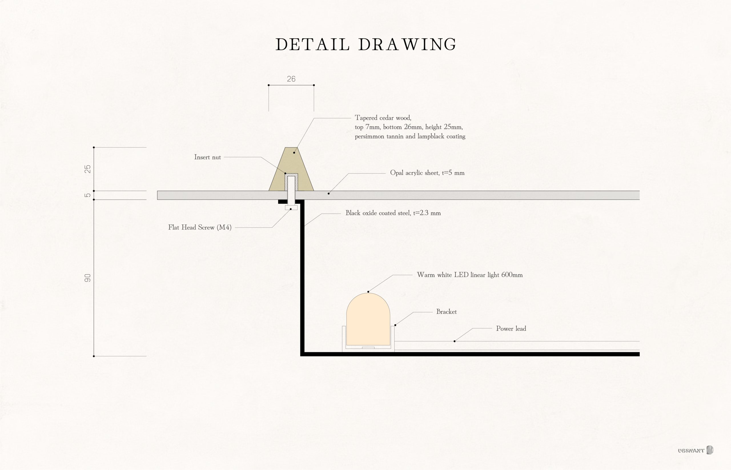
Black leather-finished iron was employed, inheriting the blacksmith's philosophy of achieving rust resistance through surface-forming techniques like hand-forging and quenching. This embodies the enduring durability seen in ancient temple nails and medieval gate doors.
For the timber elements, a natural-derived shibori-nuri finish was adopted, utilising persimmon tannin and pine soot ink traditionally used for building finishes and fabric dyes. While persimmon tannin typically requires considerable time to develop its colour, recently developed versions that reproduce ancient hues evoke the passage of time.
The semi-transparent material is an off-white acrylic, chosen to represent the transition from fire to electric light as a primary light source in daily life, while also honouring the lineage of materials like hemp, washi paper, and frosted glass.
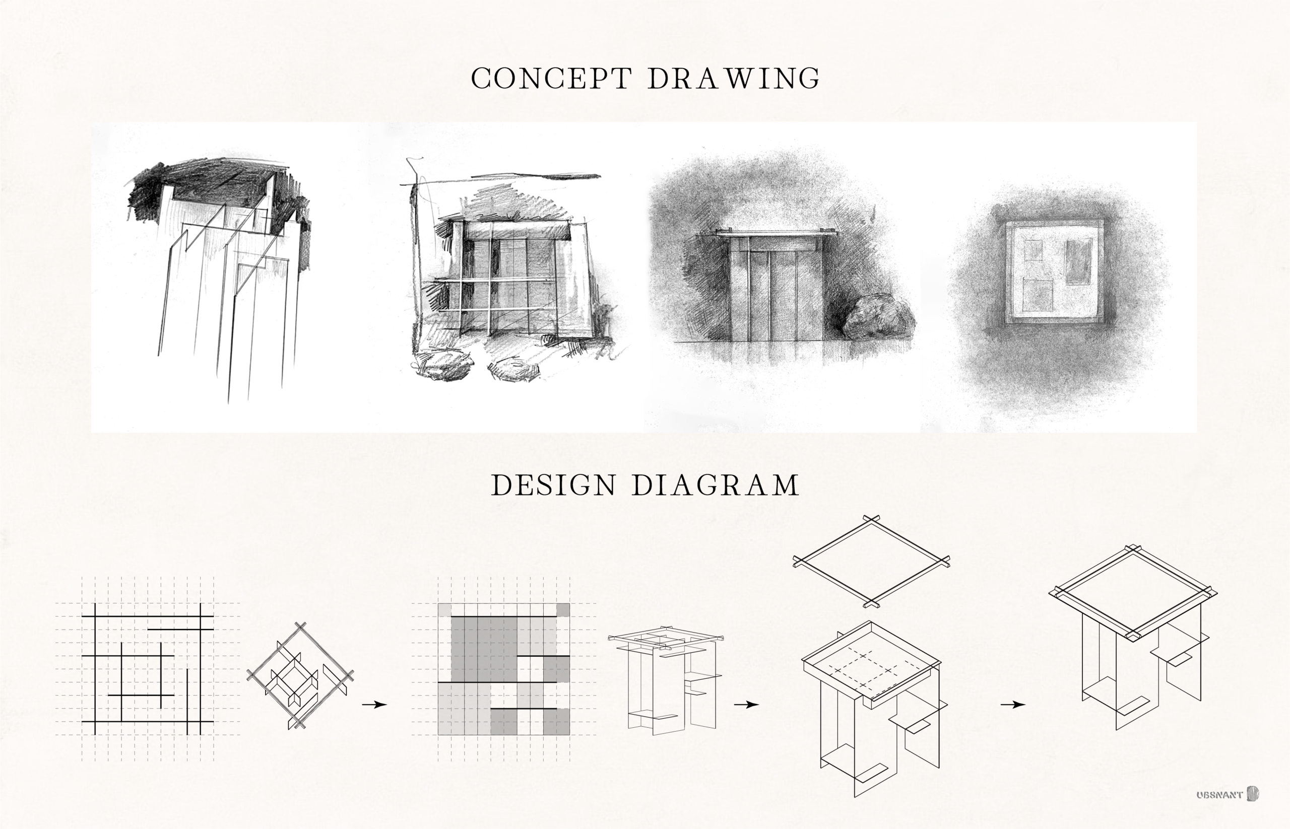
The composition of materials expands the two coexisting structural principles of Kyoto – the order represented by grid-like urban planning and lattices, and the randomness seen in Japanese garden pathways and stepping stones – into a three-dimensional, irregular grid. Referencing the arrangement of broken latticework and stepping stones, elements were positioned to resist fixed patterns, then rhythms of lattices and checkerboard patterns were inserted.
For the tabletop, the light source was concealed within the acrylic plate, set slightly inward from its edge, to create a refined impression at the terminus. Similarly, the wooden frame was made a size smaller than the tabletop, creating a square. This ensured no joints were visible on the surface, achieving a finish where the frame, acrylic plate, and steel box are fixed together as three distinct elements.
Consequently, a wooden latticework reminiscent of traditional Japanese shutters or shoji screens appears on the fixture's surface, functioning as a frame for the displayed objects.
京都を拠点とするファッションブランドTaiga Takahashi の展示什器のデザインです。
Taiga Takahashiは、 「応用考古学的」 の理念を掲げており、 過去の遺物を甦らせることで未来の考古物を発掘することを目指しています。 そのため、 展示什器には各シーズンのテーマとなる歴史的な書類や記録写真などの資料を展示することが求められました。 それには、 設計図や図版を複製するために発明されたミメオスコープと呼ばれるライトテーブルの形式が最適であると考えました。
デザインは、 応用考古学的なアプローチに則り、 鉄・ 木・ 半透明素材といった京都の建築に内在してきた時間や技法を再編する方法で行いました。
鉄には黒革鉄を用いることで、 手打ち鍛造や焼入れによって表面に被膜を生じさせ防錆性を獲得した鍛治職人の思想を引き継ぎ、 古代の寺社建築の和釘や中世の門扉といった長い耐久性を内包しています。
木部には、 建物の化粧や布の染料として用いられる、 柿渋と松煙墨を用いた天然由来の渋墨塗を採用しました。 柿渋は月日は経たないと色が発色しませんでしたが、 近年では古代色を再現した柿渋が開発され、 移ろい行く時間の流れを想起させます。
半透明な素材は、 麻、 和紙、 磨りガラスと連なる継承を踏まえ、 生活の光源が火から電球に移行したことに伴って登場した乳色色のアクリルとしました。
素材同士の構成は、 碁盤の目状の都市計画や格子に代表される秩序と、 日本庭園の延段や飛石に見られる無作為性の、 京都に共存する二つの構成原理を立体的に拡張し、 不規則なグリッドとして統合しました。 破れ井桁や飛石の配置を参照し、 一定のパターンを拒むように配置した後、 格子や市松のリズムを挿入しました。
天板は、 端部の見付けが洗練された印象を与えるように、 アクリル板の端部より内側に光源を隠しました。 同じく、 木枠も天板より一回り小さい四角にすることで、 表面に接合が見えずに、 枠・ アクリル板・ スティールの箱、 の3つが固定される納まりとしました。
結果として、 什器の表面には蔀や障子のような木格子が現れ、 展示物の額縁として機能しています。
Snippets / Furniture, Installations, Sculptures
Mimeoscope for Archeologists
考古学者のミメオスコープ